

Have you ever visited a website only to have content jumping around while the page loads?
This sort of experience characterized by images flickering in and down and content rearranging itself not only annoys users but also negatively impacts your website’s SEO ranking(if you care about that). It becomes even more apparent when your internet connection is slow.
This sort of experience characterized by images flickering in and down and content rearranging itself not only annoys users but also negatively impacts your website’s SEO ranking(if you care about that). It becomes even more apparent when your internet connection is slow.
There are many reasons why the pages may flicker. Often, the biggest contributor is images. When the web pages are loading, images without predefined dimensions or placeholders cause unexpected layout changes, leading to what developers refer to as layout shifts.
Here is a visual illustrating what a layout shift from an image looks like.
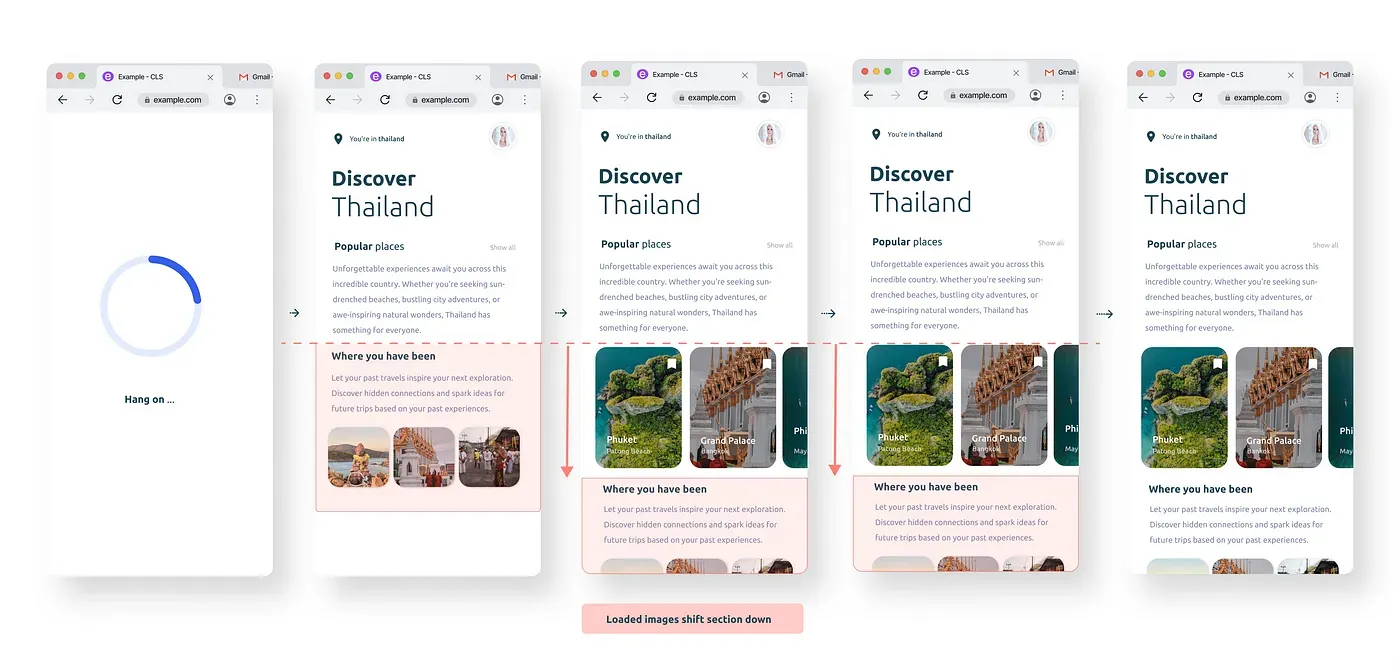
The user starts by seeing the second screen without the images and on screen 3 the images on loading push the content downwards.
It isn't very pleasant to have the sudden push of content downwards. This annoyance factor has a measure. Enter Cumulative Layout Shift (CLS), a term coined in the Core Web Vitals (basically a website’s performance report card from Google). CLS measures how much the content on your page jumps around as things load. Think of it as a score for visual stability. This metric helps developers understand the impact of unstable content on user experience — the lower the CLS, the happier your visitors will be.
How do we combat image layout shifts?
Just as you would reserve a seat for your friend at a crowded party, image placeholders can do that for your layout! They tell the browser, “Hey, there’s an image coming here, so hold this spot.” This way, the layout stays put while the images download in the background.
Developers can allocate space on the webpage in advance that will be occupied by the actual image once it loads. This preemptive measure prevents any abrupt shifts in the layout. It's important to ensure that the dimensions of your image placeholders match those of your fully rendered images. Here is an illustration of how placeholders help reduce the shift.
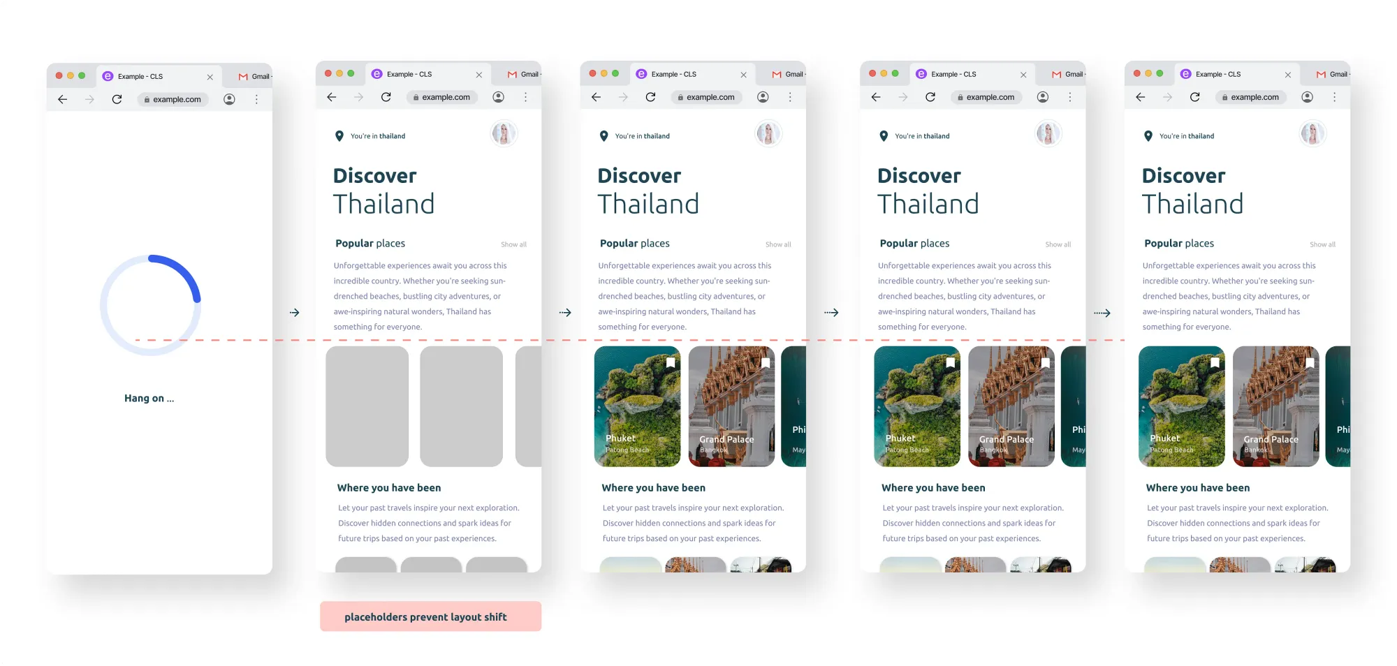
The second screen shows the grey image containers, they act as placeholders of where the images will render ensuring no layout shift when the images load on the third screen.
How do I implement placeholders?
Let’s explore how to implement image placeholders on your website. There are a couple of methods:
- Specify Image Dimensions:
This ensures the browser knows exactly how much space an image will require before loading it, maintaining the layout’s stability as other content loads.
<img src="your-image.jpg" alt="Image Description" width="600" height="400">This code defines the image width as 600 pixels and height as 400 pixels
It can also be done using CSS
img {
  width: 600px;
  height: 400px;
}
2. Using aspect ratio
Maintaining the aspect ratio of images and other media content using CSS is another technique to ensure layout stability. There are two ways:
a) Using CSS
<!--- using tailwind ---->
<img class="aspect-[2/3] w-full rounded-2xl bg-gray-100 object-cover" src="https://images.unsplash.com/photo-1585309291116-7b4938f8a296?q=80&w=3387&auto=format&fit=crop&ixlib=rb-4.0.3&ixid=M3wxMjA3fDB8MHxwaG90by1wYWdlfHx8fGVufDB8fHx8fA%3D%3D" alt="some alt"/>

<!--- using css ---->
<img class="aspect-ratio-box" src="your-image.jpg" alt="Image Description" src="https://images.unsplash.com/photo-1585309291116-7b4938f8a296?q=80&w=3387&auto=format&fit=crop&ixlib=rb-4.0.3&ixid=M3wxMjA3fDB8MHxwaG90by1wYWdlfHx8fGVufDB8fHx8fA%3D%3D" alt="some alt">


.aspect-ratio-box {
  width: 100%;
  padding-top: 66.66%;
  background-size: cover;
  background-color: #2e2e2e;
  border-radius: 1rem;
}
b) Using HTML aspect-ratio attribute
By using the aspect-ratioproperty, developers can define the desired width-to-height ratio, which helps the browser allocate the appropriate space for content before it fully loads.
<img src="your-image.jpg" alt="Image Description" class="image">.image { aspect-ratio: 2 / 3;}Bonus: Good Image Practices
While image placeholders are a powerful tool for preventing layout shifts, they’re just one piece of the puzzle. Here are some additional good image practices that people often forget about.
- Lazy loading: This method delays the loading of images outside the viewport until they are scrolled into view, giving priority to loading important content above the fold (what’s now displayed). By doing this, the user’s bandwidth is conserved and the network interface of the browser is not overloaded with photos or other material that the user may not even scroll into or view.
- Including alt text: The alt text (alternative text) gives an explanation of the image for viewers who cannot see it, such as those using screen readers or on sluggish connections where images may not load. It’s also essential for search engine optimization (SEO) since alt text helps search engines comprehend image information.
- Using onerror to show default Images: Another clever method to make sure you always have an image displayed, particularly if there is an image loading error of any kind. This can be the result of an unfound image, an incorrect URL, or an execution problem. You can describe what occurs if the picture does not load using the onerror event handler. It can be used to show the default image in place of the icon for a broken image.
<img src="image.jpg" alt="An example image" onerror="this.src='default-image.jpg';" />Conclusion
We’ve covered a lot of ground! We learned how the strategic use of image placeholders alongside robust image practices is fundamental in web development. They stabilize page content, expedite loading times, and enhance SEO, all of which are essential for delivering a seamless browsing experience that keeps users engaged and satisfied with minimal frustration.
Want to delve deeper? There are plenty of resources available to help you master image optimization and web performance. Here are a few:
- Optimizing CLS
- Lazy-loading-images
- Explore Image loading attribute
- Image_loading_errors
- More on image placeholders
Go forth and explore, and remember — a well-optimized website is a happy website (and happy users too)!